
Thought since it's been ages since I last posted anything, I'd stick up a few shots from a shoot or 2 a couple of weeks ago...
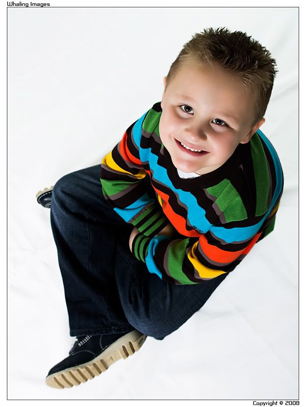
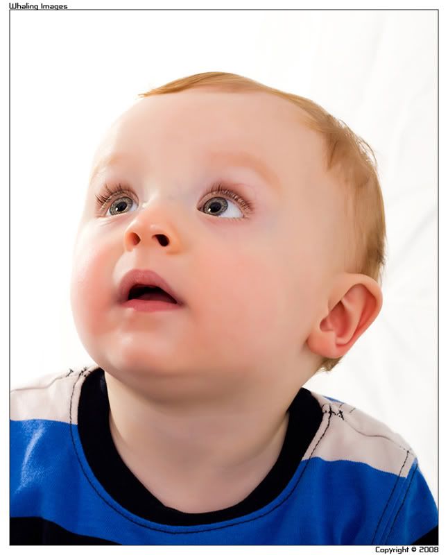
#1
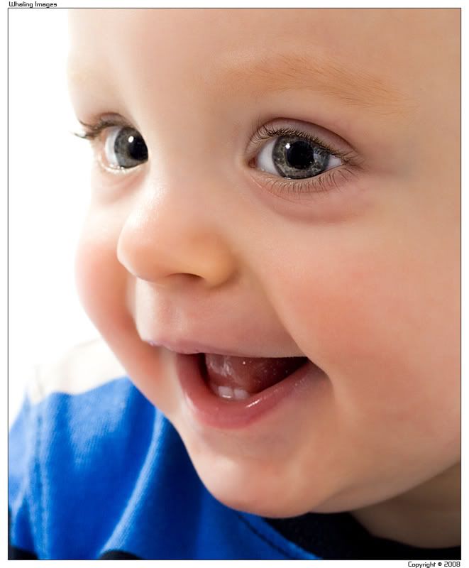
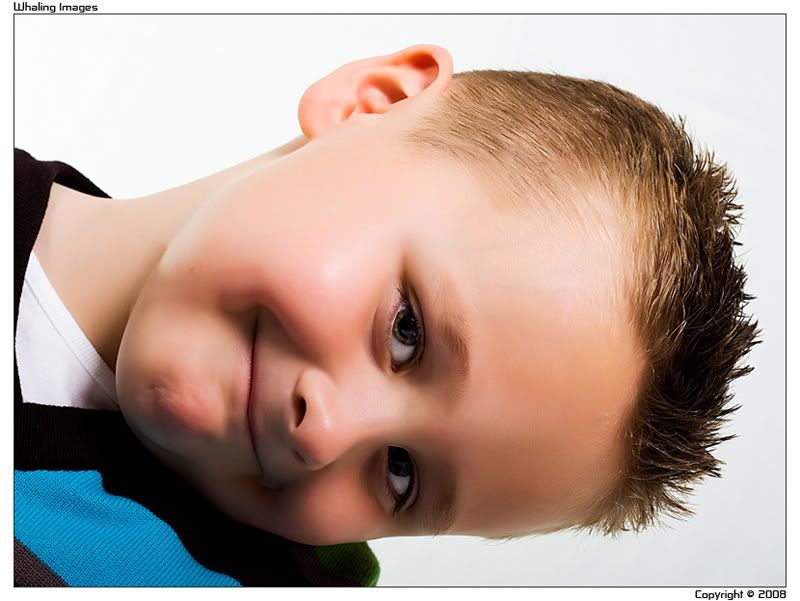
#2
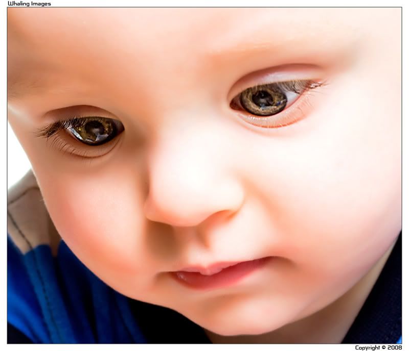
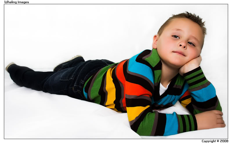
#3
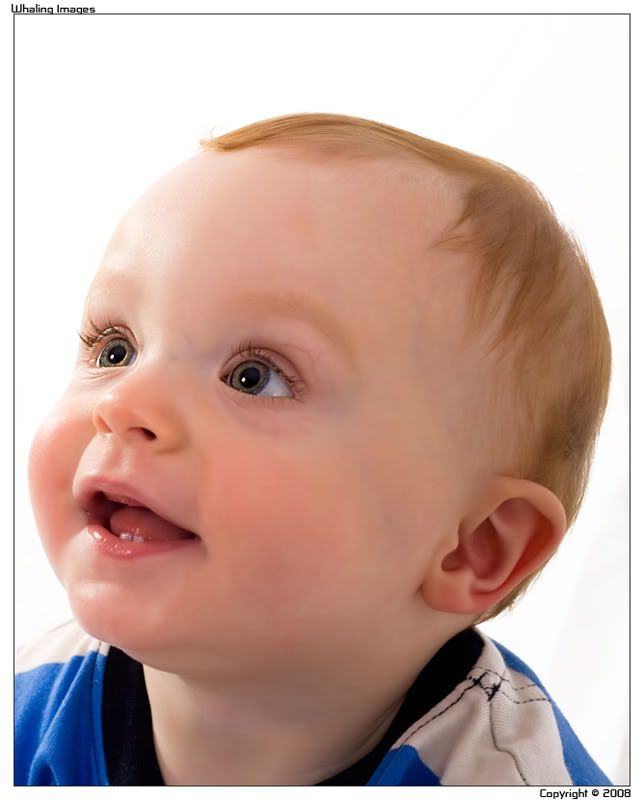
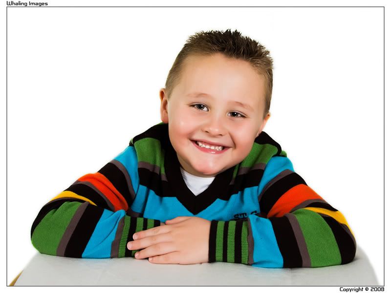
#4
#5
#6
#7
#8


Thought since it's been ages since I last posted anything, I'd stick up a few shots from a shoot or 2 a couple of weeks ago...
#1
#2
#3
#4
#5
#6
#7
#8
Last edited by neo2810; 19th December 2008 at 11:57 PM.
"There's nothing worse than arguing with someone who knows what they're talking about...."
They are all very well lit Neo, but as for actiual impact, I have to say Number 1 is the very best. Great contact and focus on the eye, and works terrific for me.
Nice series.
Paul.
number 1 mate, the bairns eyes are amazing
Absolute quality set all round mate some great focus and nice processing..i like number 2 the way it makes the little one almost look porcelain.
top stuff mate
Some cracking shots there. Again, if I had to pick one, then it would be number 1.
Cheers chaps... Feedback always appreciated
"There's nothing worse than arguing with someone who knows what they're talking about...."

Number one and number 3 for me. The kid has stunning eyes. Not sure on number 2 as it makes him look like one of them realistic dolls.
Also not sure on the last one as the kid looks like he's floating.
Originally Posted by beerman

Cheers Beerman... Cant love em all I say
"There's nothing worse than arguing with someone who knows what they're talking about...."
Some nice images there mate, can't say I like them all but no.1 is is my favourite. Nice composition and toothy smile,maybe a little harsh on the left hand side of his face with the lighting, but that could just be my monitor.
As for the rest I have to be honest and say they don't do nothing much for me, technically or aesthetically, sorry mate. No .2 Looks way to over processed and has made his skin look very fake, not liking the pose on 3 and 4 plus the slight dead space above his head is distracting, and in the past your boy (I'm presuming that's your boy in the remaining shots), has given you some cracking shots but in the last few his poses look a little forced and un-natural. Also it seems as though he wasn't shot against a white background and that he has been cut out and placed on a fresh white one, I know I'm wrong there as you can see a crease of the background in one image but it looks like the foreground doesn't belong with the background. Sorry I can't be more positive abut these images but I feel it's better to honest, how else can we improve on our shots?
But nice set though mate and I hope that the clients liked them, as at the end of the day anonymous forum users can say what they like it's the client or recipient that are your biggest critique and the ones that matter.
Honest crit is absolutely fine Matt.
You're right about the background in that I used a white tarpaulin type sheet setup as an infinity curve, but it was creased a bit an not ironable (word?). Therefore it took a bit of PP to get rid of the creases and selectively lighten. That's not ideal so inevitably will be picked up by the trained eye. I'll be sorting myself out with proper studio stands and a paper background at some point, as well as better back lighting to blow it out.
The crops were client request really (they had been to venture and had to give up a few close crops so wanted me to replicate). The overprocessed look on some was also client request. I'm also not into the over porcelian look normally.
Appreciate the pointers though Matt, every negative give us another avenue to improve. Cheers chap.
PS: Neither of them are my kids...
Last edited by neo2810; 21st December 2008 at 04:45 PM.
"There's nothing worse than arguing with someone who knows what they're talking about...."
A cool set, i can't comment on them technically but aesthetically I think they look great and better than a lot of studio shots i've seen of my mates kids. 2 is my fav as well
Good set Neo, really nice and the eyes look great.
It would have to be no.1 for me. The skin on no.2 seems a little to shopped TBH. I would have taken the background lines out on the right of no.4.
Can I ask what lighting you used and how many?
Devs.
P.S. Have you tried any of these in B+W?
Cheers Steve...
No 2 is overprocessed intentionally by client request. I agree it's a litte ott, but that's what they wanted, hey ho...
Yes, the lines on No 4 could be removed, lazy on my part I guess.
I included a few b&w copies for the clients.
Lighting setup was main 60deg right at 1/4 through softbox, aux left 45deg through clear umbrella at 1/8. then 2x 430EX with stofen's aimed at background left and right. To be honest, the 430's are not up to the job of bleaching the bg so I'm going to have to get a couple more studio lights and mount them from the ceiling once I've sorted my studio out (in the process of looking at setting up with my brother)...
In all honesty, studio work is fairly new to me, but I'm learning quickly. My brother is the pro fashion photographer (or was) and has more tech knowhow in the studio than me. I've always been more a landscape/street photographer and prefer on location shoots. Would love a Broncolour Verso lighting setup, but I don't have a few grand spare at the minute
Last edited by neo2810; 22nd December 2008 at 01:24 PM.
"There's nothing worse than arguing with someone who knows what they're talking about...."
Great work Neo, your doing good work with the set up! I'm hoping to try a few kid shot in the NY so its good to hear how you have used your lighting. The only other comment that I would add is to maybe consider using some props toys etc as they sometimes add an extra element on colour/intrest to the frame.
Thanks for sharing the set.
Devs.

think the 1st one is terrific mate, cracking eye shots. you gotta be pleased though?
Sorry I missed this thread.
Lovely shots Neo, all praise and crit has been covered and by people which much more knowledge than myself.
I do like the composition of these shots though and the focus on the eyes in the first definitely is excellent. Looks like I can see you being reflected in the 2nd shot though which I know is difficult to avoid at times for sure
I have to say the colours in the shots with the lad in his stripey jumper are excellent. A good contrast to the white background. I think your clients will be extremely pleased with these shots mate.
Cheers Steve. Sadly, at the moment I'm working in my dining room which is too small really (about 12ft x 12ft) so I've got to be a little creative with the lighting position to ensure some space is left between subject and bg. Things will be alot easier once we have a proper studio (although that may be a little way off).
I agree props help, and with a little more planning I may have had some. I'll be asking future jobs to bring some personal things to use. Usually that helps. As I said though, I much prefer environmental portraits so I'm a little slow on ideas to get the most out of white studio shoots at the moment. That will come with time though.
Cheers Ming, I was very happy myself with these shots to be honest. They were pretty much exactly what was requested by the clients.
Thanks Ian, I agree, the colours have come out really well in the second set (thanks to Portraiture
"There's nothing worse than arguing with someone who knows what they're talking about...."
Thats for FACES!!!lol

love the first and second one best. the expression on the child face
Faces, hands, feet, clothes, grass, trains, sky, mountains.... Your fault mind!
"There's nothing worse than arguing with someone who knows what they're talking about...."
 Posting Permissions


 Reply With Quote
Social Networking Bookmarks