


This will be the final result
1. The first thing we need to do is create a brand new document. For this tutorial we will be using a canvas of 400×400
2. We want to go ahead and change our background color to #000000 to start things off.
3. Next, using your rounded rectangle tool to make a selection similar to the following with the radius set to 10px
4. We want to go ahead and liven this up a bit, so lets go ahead and add some blending options by right clicking your rounded rectangle layer and choosing blending options and inputing the following
5. You should have something that looks very similar to the following at this point:
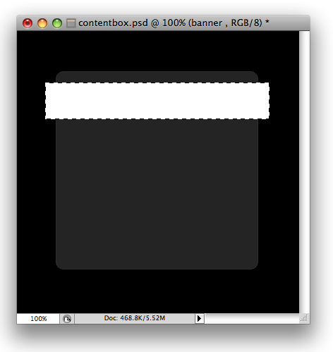
6. The next thing we want to do is use our rectangle marquee tool to make a selection similar to the following and fill it with white
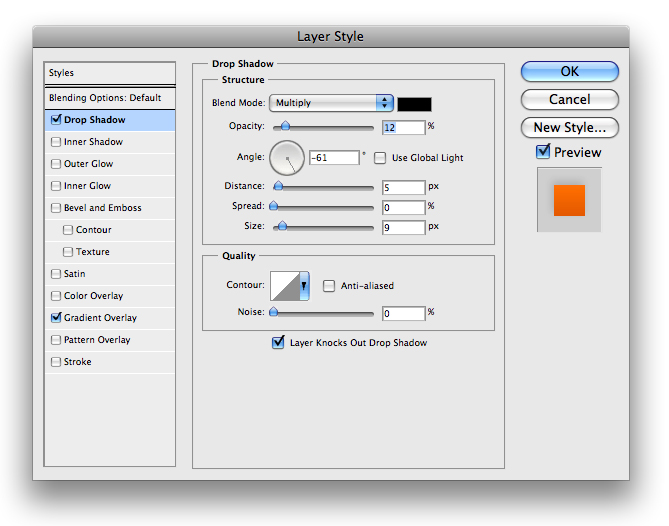
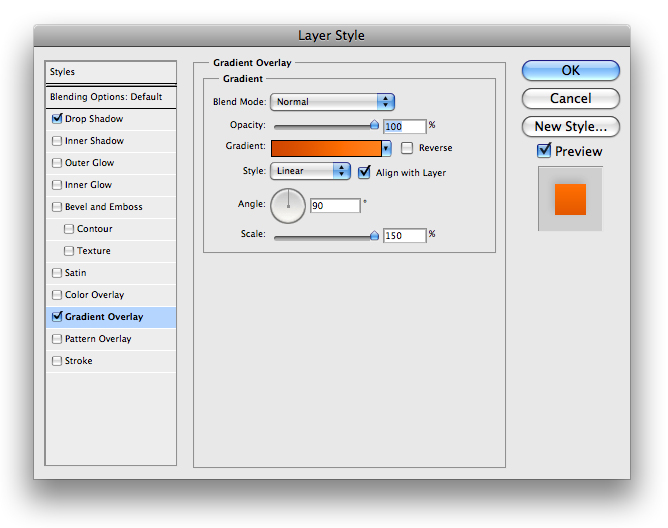
7. Obviously… we aren’t going to keep it white, so lets go ahead and right click our layer in input the following blending options
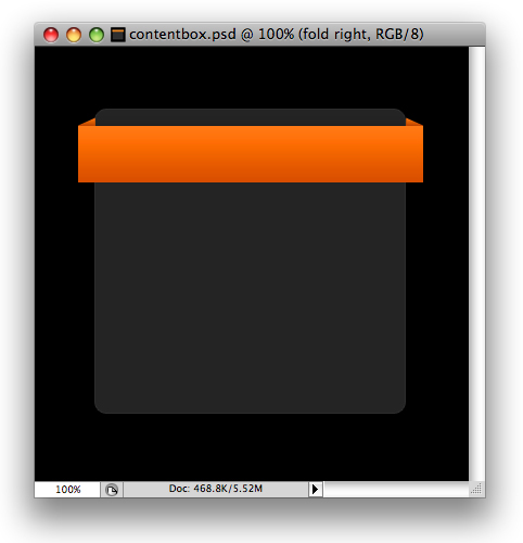
8. And you should have something that looks like the following
9. the next part we will be doing is the folds of our ‘banner’. It will give us the perspective we need. Use your polygonal lasso tool and create a selection similar to the following and fill it with #FFFFFF
10. We then want to go ahead and input the following blending options onto its layer:
11. Now just repeat those same steps for the other side and you should have something that looks like this
12. The next thing we want to do is add a little heading for our content box. So lets go ahead and pull out your text tool and input some text for your heading:
13. White is a little… well… bland. So what we want to do is right click your layer and input the following blending options
14. You will have something that looks like the following, which is starting to look much better
15. There is one more thing we can do to this though. Go ahead and duplicate your text layer and make sure all your blending options are turned off on this new layer and that the font color is set to #FFFFFF. Put this layer below your original text layer and then using your arrow keys move it down 1px.
16. That is very strong, so we want to go ahead and tone it down a bit. Lets go ahead and lower the opacity to about 28% and you’ll have something that looks like this:
17. Thats pretty much it! You can add a little icon for your content box, and then add some links and it will look something like this
Remember if you have any questions or comments about this tutorial to leave your responses in the comments below and we will get back to you very quickly. If you enjoyed this tutorial, please take a moment to visit one of our sponsors.


 Reply With Quote


Social Networking Bookmarks