


 Creative Button Animations with Sprites and JQuery (Part 1: Photoshop)
This tutorial will show you how to build creative hover animations for buttons using sprites. The particular effect illustrated in this tutorial is inspired by the “Download” buttons on Tutorial9.net. Part 1 of this tutorial explains the design process in Photoshop. In Part 2 we will convert it to XHTML + CSS and as a bonus we will also use jQuery for a fading hover effect.
View Demo: Button Animation Demo
Skip to Part 2: Click Here (Demo files available for download)
Step 1 – Create the shape
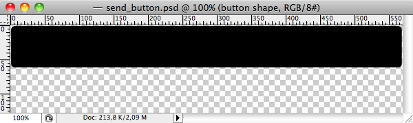
Create a new document in photoshop fit to your needs. In this instance, I’ll be creating a 570px wide button. The height of the new canvas should be twice the height of the button needed (explained later, but for now just use the top half of the canvas).
We’re going to make a rounded button. Use the Rounded Rectangle Tool with a radius of 5px. Keep in mind that we will add a border and shadow, so leave some white space around the button.
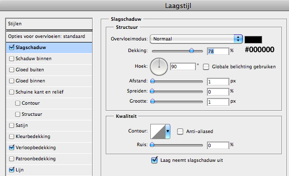
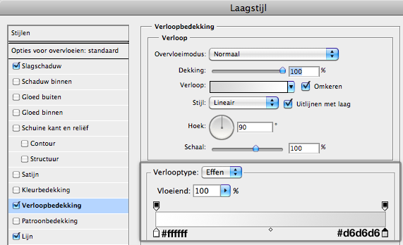
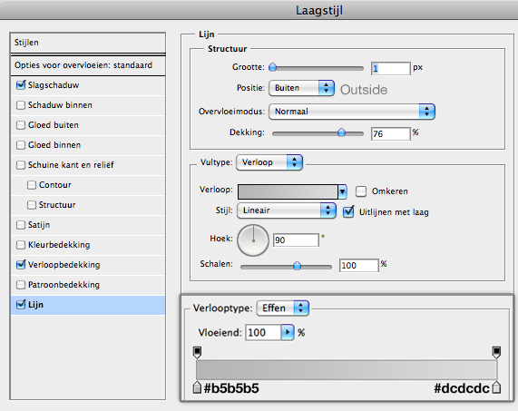
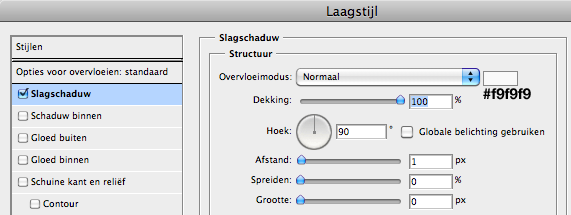
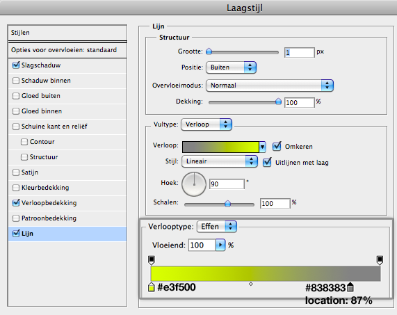
Step 2 – Add layer styles
We will use a pretty basic color scheme for the initial state of the button. The surprise (I call it the wow-effect because of the contrast) will be added in the color scheme of the hover state button.
Note from Editor
The diagrams shown are not in English, but the diagrams will apply to English versions of Photoshop as well. We apologize for any inconvenience.
Drop shadow
Gradient overlay
Stroke
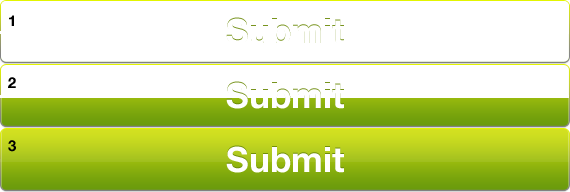
Step 3 – Highlights
Select the the shape of the button: Ctrl (Cmd for Mac users) + Click the Layer Thumbnail in the Layers Palette. Now add a new layer and fill the selection with the color #fafafa (use the Bucket tool). Select the selection tool and move the selection 1px to the right. Now click backspace and the selection will be deleted. Now you need to move the selection 1px up and delete the selection. The last step is to move the selection 2px down and delete the selection. What remains is a sleek highlight effect on the left side of the button.
Apply the same trick on the right side of the button.
Step 4 – Button text
Type the text "Send" or "Submit", or whatever you wish:
- font: Helvetica Neue Bold
- font-size: 35px
- color: #343434
Add also the following layer style:
Final image
Step 5 – Prepare the canvas for a sprite
We’re going to make a sprite of the buttons. Why sprites and not single images? Why combine all those images? Isn�t it quicker to have smaller images?
Using CSS sprites allows you to greatly increase your websites speed by using single image files that contain multiple graphics. In other words, when you have many images to be used, instead of having them as different individual files, we combine them into one. Therefore, the client computer only downloads one image for all the different graphics to be displayed.Measure the height of the button. My example has a height of 64px. The link hover button will have the same size as the link button so my Photoshop canvas needs to have a height of 128px (= 2 x 64px). Use Ctrl/Cmd + Alt + C to change the height of the canvas.
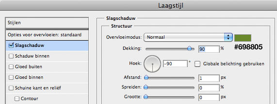
Step 6 – The link hover button
Select all layers in the layers palette and place them in one group. Duplicate this group and move it down to the empty space. Now you have the same two buttons in the sprite.
Change the color of the copied text to #fffff and change the drop shadow:
Add the following layer styles on the copied button shape:
Drop shadow: don’t change it.
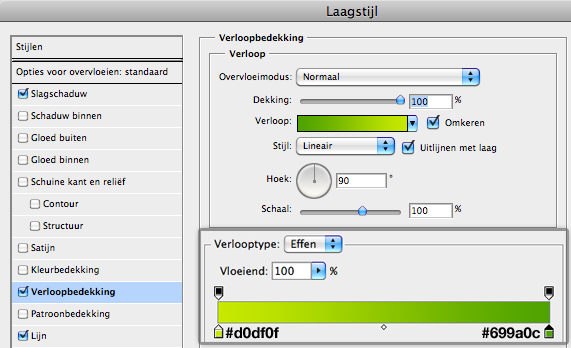
Gradient overlay
Stroke
Final touches
We’re going to add some gloss to the link hover button. Select the the shape of the button: Ctrl/Cmd + Click the Layer Thumbnail in the Layers Palette. And fill a new layer with the color #ffffff using the Bucket tool. Cut Away the bottom part with the Selection tool and change the opacity to 7%.
The final touch is changing the opacity of the highlights to 30% (which is already applied in the image above), because the original ones are too strong for the green button.
Final image
Save the image/sprite for web and you’re finished with the design part. It’s time to move on to the development part!
Continue: Continue to Part 2 »
Ending Design Note: Create your own buttons
Use colors that fit into your design. To create a simple 3D effect for the link hover button, you can also flip (the background of) the link button vertically. This works fine if you�re using a simple gradient.
Don’t use too many buttons like these on your website. If you wan’t to use several buttons on one page it’s better to create small buttons.


 Reply With Quote


Social Networking Bookmarks