


Windows 8, along with Surface RT, is the biggest, most riskiest product Microsoft has worked on since the original Xbox over ten years ago. On the face of it, the company has significantly changed the way users use Windows , with a user-interface that is targeted more towards touch input on tablets rather than your traditional mouse and touchpad, but I�m here to tell you, in a good amount of detail, that that would be insult to folks who have been working on Windows 8 for the past 3-4 years.
So, is the touch-oriented user interface a step in the right direction? Or is it a terrible mix of the tablet and desktop world? Find out after the jump.
System Specifications
Before I get into it, I�d like to inform you that I�ve been using Windows 8 Pro 64-bit for the last month on a Toshiba P755 with the following specifications:
- Intel Core-i7 2620M: Quad-core, 2.2GHz (Turbo Boost up to 2.9GHz)
- 4GB DDR3 RAM
- Intel HD Graphics 3000 / NVIDIA GeForce GT 540M (switchable graphics!)
- 1366 x 768 15.6� display | 1920 x 1080 21� Samsung LED monitor (connected via HDMI)
After downloading the ISO from MSDN, creating a bootable disc, it took me less than 30 minutes to go from the installer to the new �Metro� Start screen.
First Impressions
When the Start screen�s tiles slid into view for the first time and I started moving the mouse pointer around, my first feeling was a mix of oh-Lord-Almighty-this-so-beautiful and how-the-hell-does-this-thing-even-work!?. Scrolling horizontally, not really knowing how to switch between apps, using full-screen apps for the first time, and not knowing how to see all installed apps generated plenty of confusion. This is the biggest shortcoming of Windows 8: it�s difficult to understand at first. This is especially considering how I am, after all, someone who has been using computers for a long time.
Getting Used To It All
But, after an day or two of messing about the Start screen, I really started getting how it worked. It has one hell of a steep learning curve, no doubt about that.
The corners of the screen, which are referred to as hot corners, activate special functionality. The top right and bottom right corner reveals the Charms menu � which we will discuss in a minute � while the top left corner lets you switch to the previous app and the bottom left corner lets you launch the Start screen from the Desktop (and vice versa). Opening up the app switcher requires you to move your mouse pointer to the top left corner and then move it along the left edge.
On touch-screens, calling up these menus takes simple swipes and a button press at max. Unless you have something like a Microsoft Touch Mouse or Wedge Mouse with support for Windows 8 gestures, you�re not going to be completely comfortable with it.
The Start Screen
The Start button has been a part of Windows since the mid 90s, so removing it after all these years is bound to cause confusion and invite negative criticism from loyal users.
Well, I�m here to tell you that it ain�t so bad. As a matter of fact, after four weeks of use, if I were given the option to choose between the Start menu of Windows 7 or the Start screen on Windows 8, I�d opt for the latter despite a few shortcomings, and here�s why: it�s dynamic, smooth as butter, looks amazing, works well (with the right input device) and has immense potential.
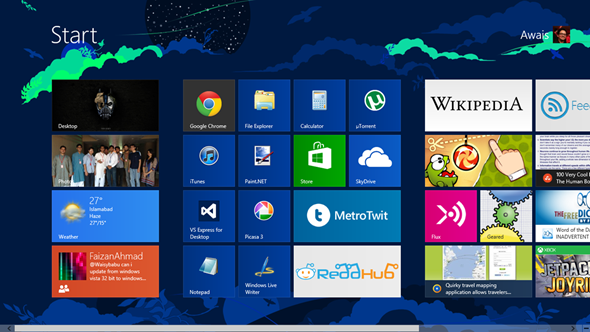
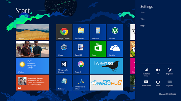
It�s a lot like Windows Phone�s Start screen scaled up to larger displays, except you get to scroll horizontally. You can pin Live Tiles to the Start screen for apps built for Windows 8, which display updated information like the weather, the latest items in your news reader, the word of the day, updates from Facebook and Twitter and more.
The list of apps that currently have this functionality is rather small at the moment, but I strongly expect them to grow quickly in the coming weeks and months as more and more users jump on to Windows 8 and developers realize that the platform cannot be ignored (the way Windows Phone was and is still ignored).
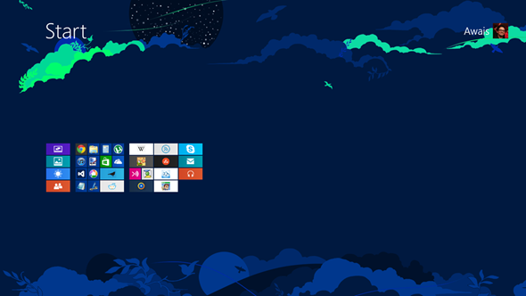
Zoomed out view.
Windows Store and �Metro� Apps
Although Windows 8 does flawlessly support legacy x86 apps(the kind you�re currently running on Windows XP or 7), they aren�t the ones Microsoft really wants developers to develop or users to use.
�Metro� apps, as they are called, are typography-centric, animation-heavy, horizontally-scrolling full-screen apps. When designed right, they look stunning and work better than any other rival app on other platforms.
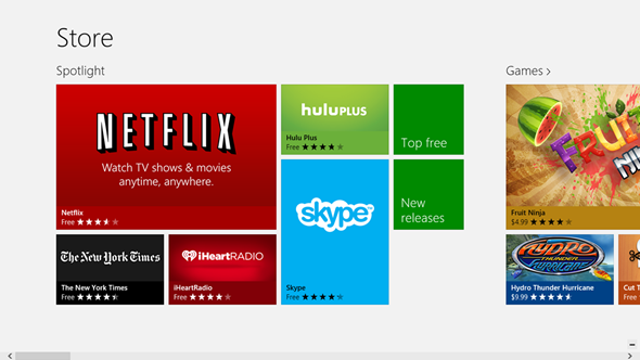
With the advent of the �app stores� on other platforms, it was inevitable for Microsoft to start its own. Windows Store on Windows 8 is just that: a software-distribution platform curated by Microsoft. If a developer�s app meets certain (controversial) guidelines, it can be distributed through the Windows Store.
Advantages of using the Windows Store is the same as other stores. It makes searching for apps and updating them much much easier.
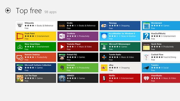
As stated under the previous heading, the number and quality of apps at the moment is limited. There are no official apps for Facebook, Twitter, YouTube and mobile apps like Flipboard, Pocket are missing. There is also a distinct lack of strong photo / video editing apps; the sort that content-creating �power users� would use.
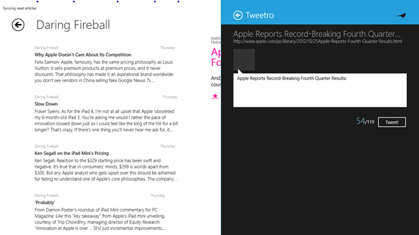
Quality apps like Tweetro / MetroTwit, FeedReader / Flux, ReddHub, Skype, Netflix, Hulu Plus, Fruit Ninja, Jetpack Joyride do ease the pain, but the Windows Store has a long time to go before it becomes as populated with quality apps as Mac App Store.
Using Full-screen Apps
Let me get this out of the way: I�m not a fan of full-screen apps. They simply use up too much screen real estate. It would be easy to forgive this on tablets with displays smaller than 10�, but when you�re using a mid-sized notebook or a larger monitor, not being able to see the time at a glance or currently runnings is just unpleasant.
Microsoft does help make things easier by allowing you to snap Metro apps to the left or right edge of your screen. It works flawlessly when you snap, say, a news reading app like Flux with your browser. I look forward to using it this way.
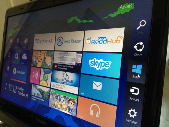
Charms
Pointing your mouse to the top right corner reveals the very useful Charms menu with five buttons: Search, Share, Start, Devices and Settings.
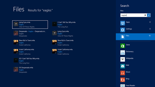
Search in Windows 8 is context-sensitive. Calling it up from the Desktop searches for Apps, Settings and Files. Using it from ReddHub will search Reddit, The Free Dictionary will search for terms, Wikipedia will search for articles etc. etc.
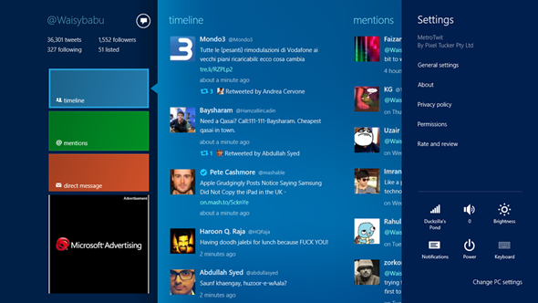
Share, too, is context-sensitive. When you click on Share from a news-reading app like Flux, you get options to share it to Mail, Tweetro, People, SkyDrive and more. It isn�t flawless at the moment, as at times it just throws its hands up. Hopefully, the execut1on will improve in the feature, as the concept is so much better than iOS / OS X.
Devices is self-explanatory. It acts as a center from which you can choose what to do with connected devices such as displays, printers, cameras etc.
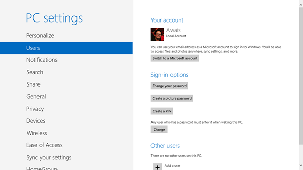
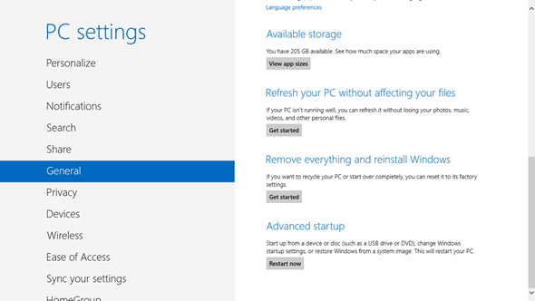
Settings, again, is context-sensitive. From the Start Screen / Desktop, you can access WiFi, volume / brightness control, notifications and power. If you wish to head down deeper, you can change PC Settings which is, essentially, a simplified version of Control Panel. Accessing Settings from an app like MetroTwit lets you change its own settings.
The concept of Charms is wholly authentic and while its implementation isn�t 100% flawless (as you can see from its half-assed Share functionality), it is still head and shoulders above the competition.
Enhancements to the Desktop
If you�re a power-user who lives in the desktop (which is now treated as an app under the new Start screen), you may not be all that excited by Windows 8. After all, if you�re anything like me, you use programs like Chrome, iTunes, Windows Live Writer, Paint.NET, Picasa 3 which are still designed for older versions of Windows and do not support Charms, Live Tiles (though a, well, dead Tile can be pinned without an issue), and aren�t available from the Windows Store so they can�t be updated in one click.
Thankfully, there are a number of enhancements and all-new features in Desktop Mode that are reason enough to upgrade to Windows 8 from previous versions.
Aero Glass Is Gone!
Remember the transparent glass chrome that was introduced in Windows Vista and enhanced in 7? It has been completely removed and it is, without a doubt, more than welcome. It improves system performance (no CPU/GPU cycles are wasted on rendering transparency effects), and reduces distraction.
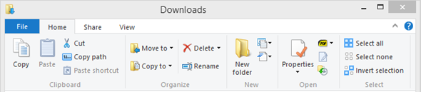
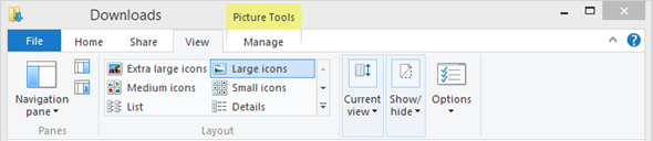
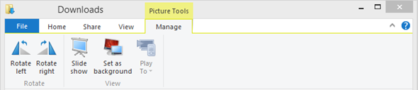
Windows Explorer �> File Explorer
Windows Explorer is now named File Explorer in Windows 8 and comes with the Ribbon UI that was introduced with Office 2007. It has to be collapsed through a downward-facing arrow from the top-right corner for the first time, though.
Ribbon UI is focused on bringing the most used and useful functions to the front. There are four tabs: Home, Share, View and Manage. Home has basic file manipulation options. Share lets you zip, burn to disc, share on HomeGroups in a click etc. View lets you change how you view your files, choose their sorting / grouping options. Manage is context-sensitive: for example if you select a photo, you can set as background, play slideshow; with an MP3 file, you can choose to Play it or add it to Playlist under Windows Media Player.
I�m a fan of keyboard shortcuts, so I don�t get to use File Explorer�s Ribbon UI much, but it is great when you discover new features you never knew existed before.
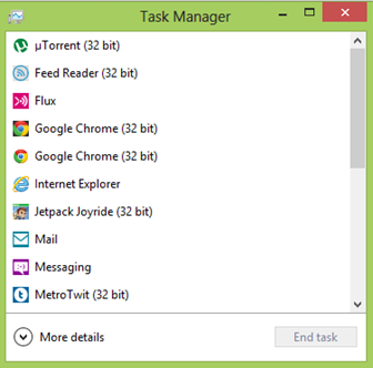
New Task Manager
Task Manager, in its default view, is more simplified and focused, showing you running processes and an End Task option with which you can quickly cut a process� life short.
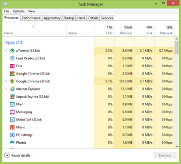
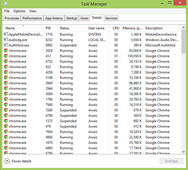
Clicking on More Details shows up seven tabs: Processes, Performance, App History, Startup, Users, Details and Services.
Processes gives you nice details about each process such as how much of your CPU / Memory / Disk / Network it is using.* Performance lets you see overall CPU, Memory Disk and Network usage. Startup lets you enable / disable programs that try booting on startup. Details is essentially the old Task Manager. The rest of tabs, dear reader, are self-explanatory.
Another welcome feature.
Easy Refresh / Restore
Another two awesome all-new features in Windows 8 are Refresh and Restore. Previously, if your PC�s performance decreased over time, your best, most effective option would�ve been to perform a fresh installation of Windows and then install and set up your programs one by one, and transfer back your photos, videos and music from an external hard drive back to your PC. It was a painfully slow procedure that required a lot of personal attention.
That is no longer the case with Windows 8, as you can now Restore it to Factory Settings with a few clicks. Additionally, if you wish to maintain your photos, music, videos etc. you can use Refresh.
Performance and Under The Hood Improvements
So far, we�ve only mentioned the biggest over-the-hood improvements and new features in Windows 8. There are easy to miss, but there are significant under-the-hood improvements in Windows 8. Boot times are improved from minutes on my Windows 7 installation to less than 40 seconds to usable state on Windows 8. Shutdown and sleep/wakeup times see similar improvements.
Previously known as Microsoft Security Essentials, Windows Defender with full anti-malware protection is baked right into the OS; it�s all you need for protection against viruses, trojans, spyware and more.
Other features like UEFI, Secure Boot, idle hygiene, background tasks all add up to significantly improve general performance.
However, despite using it on such a high performance notebook, I did feel that Metro apps were sluggish on initial launch; they just spend way too much time on the splash screen and initial menus.
Conclusion
Don�t let the negativity surrounding Windows 8 get to you. Whether you�re a power user using your PC for video editing, programming or a low-end user who likes to play casual games, use Google and enjoy cat GIFs on imgur as a content consumer, it�s the most advanced and awesome version of Windows yet and it wholly deserves your attention,
For power users, there�s enhancements to the desktop and significant performance improvements. For others, there�s the much more user-friendly (once you get the idea behind it, that is) Metro Start screen and Windows Store apps.
Windows 8 is highly recommended.
Score: RP Rank: 8 / 10
Source

 Reply With Quote


Social Networking Bookmarks